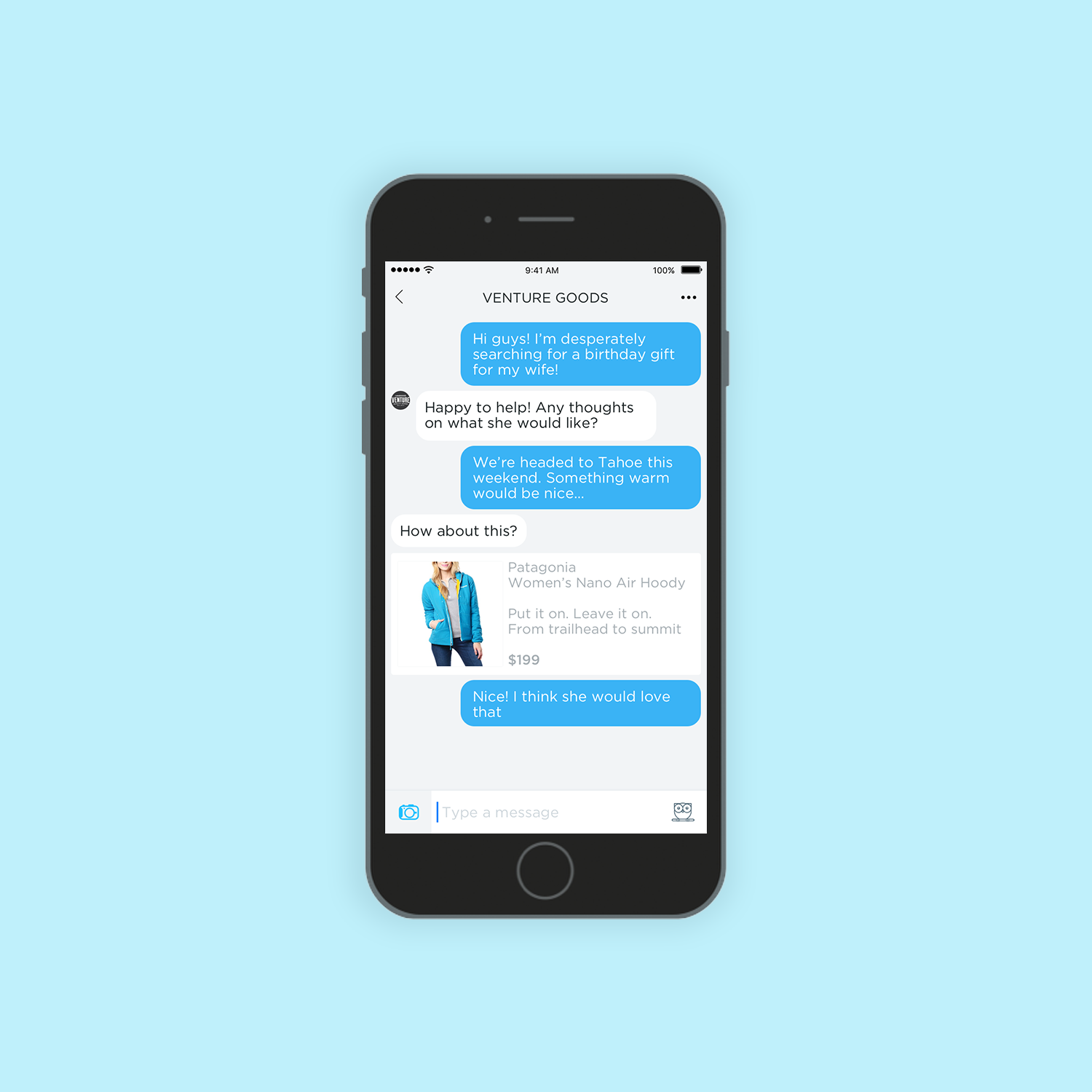
Nearby Mobile Messenger
The Nearby consumer app was built for customers to communicate with their favorite local merchants. I was solely responsible for the entire product design.
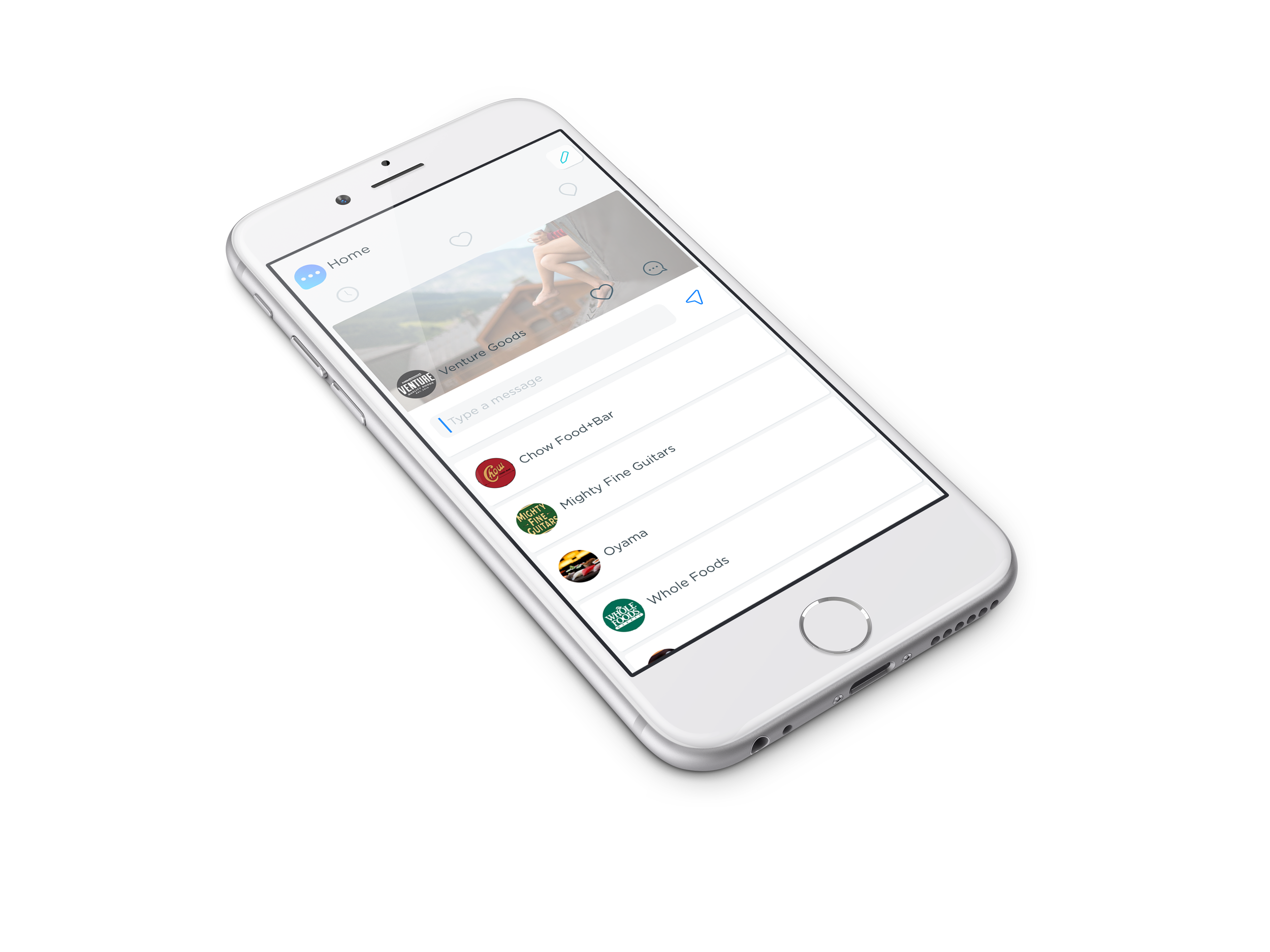
Tap on a business and quickly send a message.
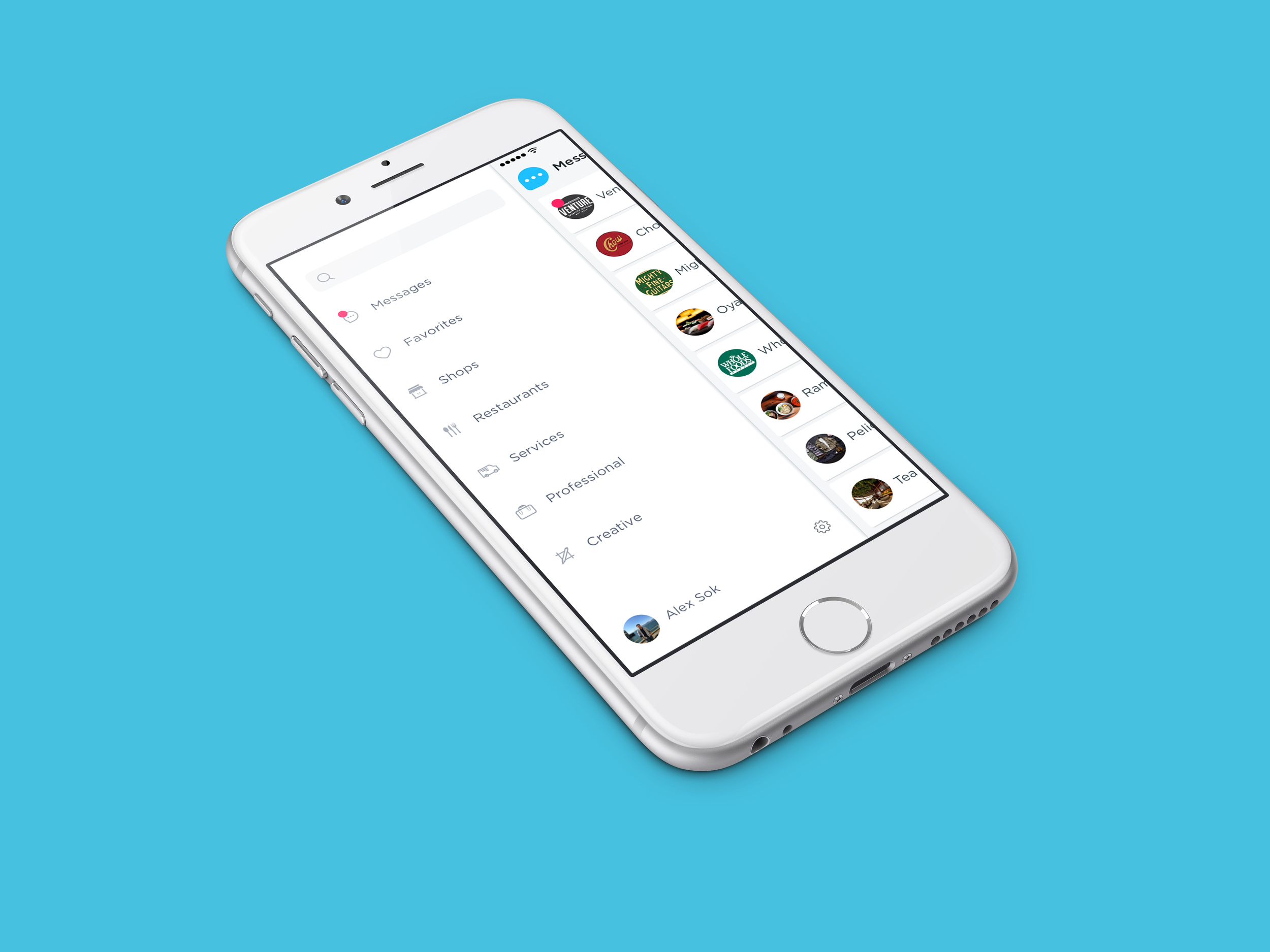
Merchants are categorized for our users to quickly locate what they're looking for.
Flow
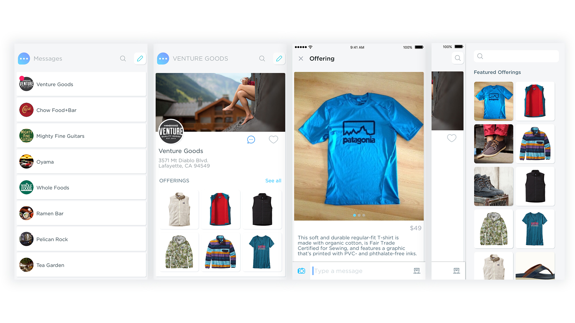
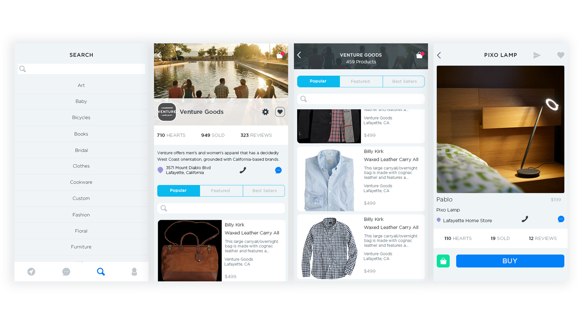
We integrated the messaging experience around the discovery experience and to showcase our wonderful merchants, their offerings, and relevant information.
From left to right. 1. Merchant list either from proximity or favorites. 2. Merchant profile screen. 3. Product offering from the merchant. 4. Offerings that can be accessed from the merchant profile screen by swiping left.
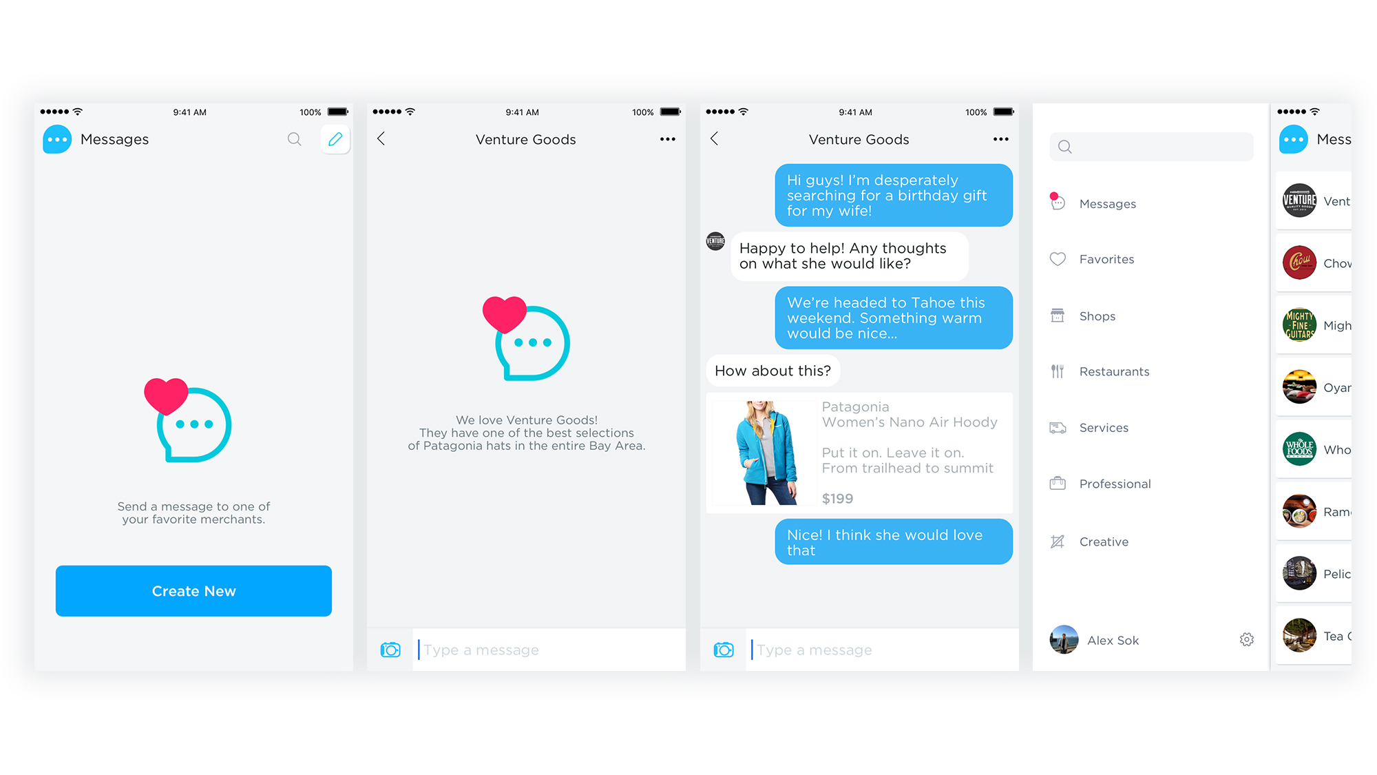
Different States
Designs for different states and interactions.
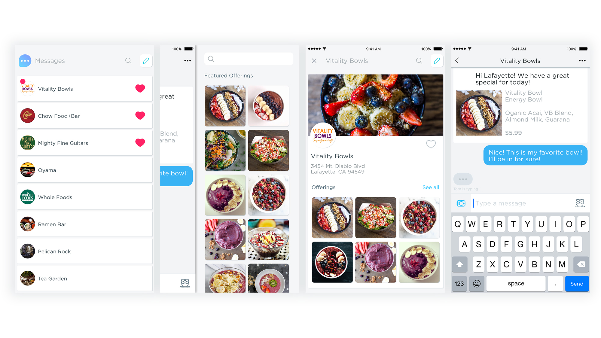
Vitality Bowl
One of our merchant partners, Vitality Bowl needed a solution for their customers to explore and discover their menu, find their new locations, and be able to stay intimately connected with their growing customer base. Offering our own app experience was critical in their decision to give us a chance to serve them. It allowed us to partner with them, get critical feedback, and design an experience to meet their unique business needs.
Early Iterations and Ideation
How do we bridge local commerce with mobile messaging? How can we make unique items and services easy to find? How can we display our merchants and their products in a beautiful way? These are the questions we started with and set out to accomplish.
In meeting with our super early alpha users, they made it clear they wanted a full platform experience for them and their customers. That's why we decided to build our own mobile consumer app, even though we knew it would be a tough ask for our users to download a new app. Our early users also didn't want to use existing messengers because they didn't want to mix their personal lives with their consumer experience.
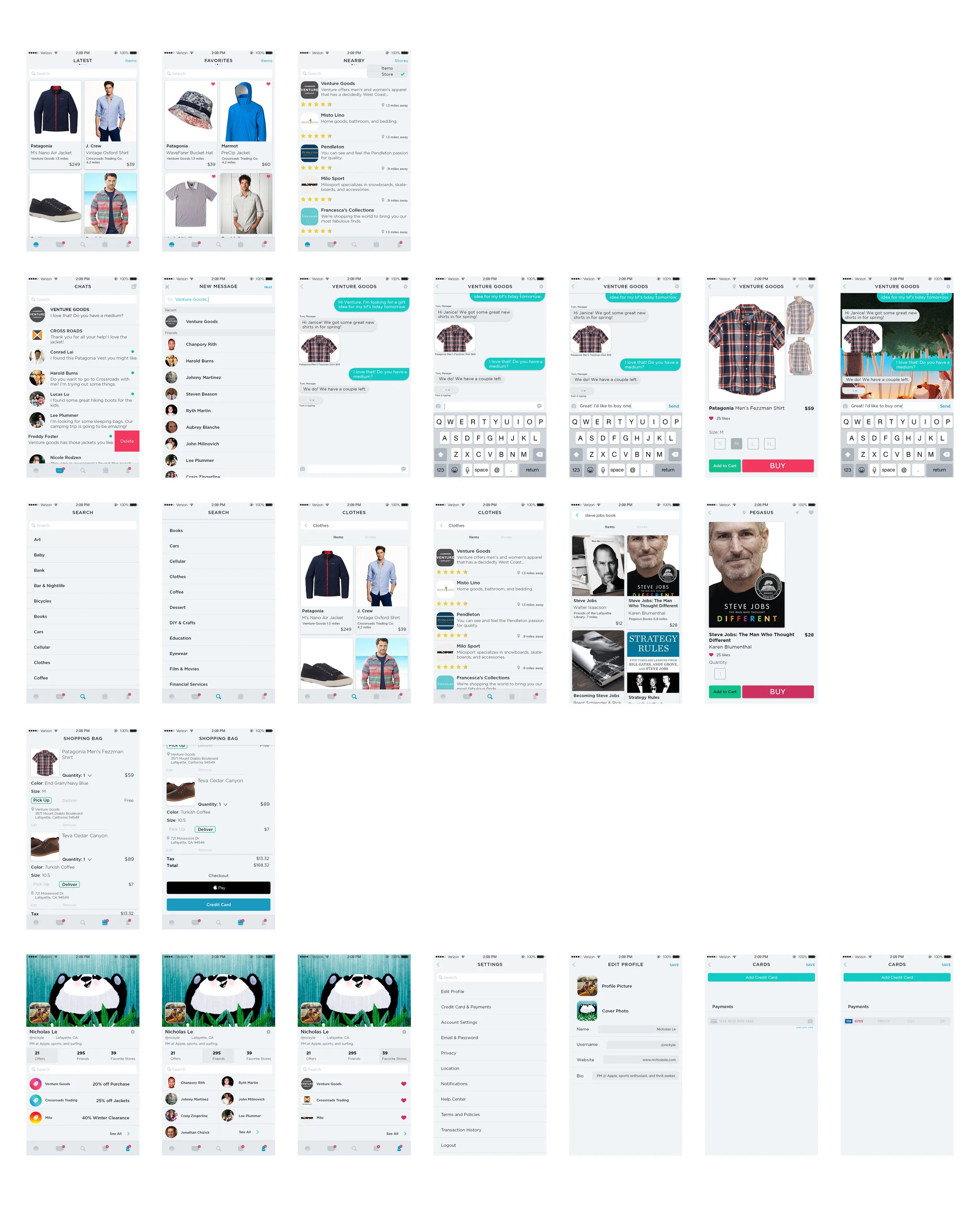
Early Screen Flow
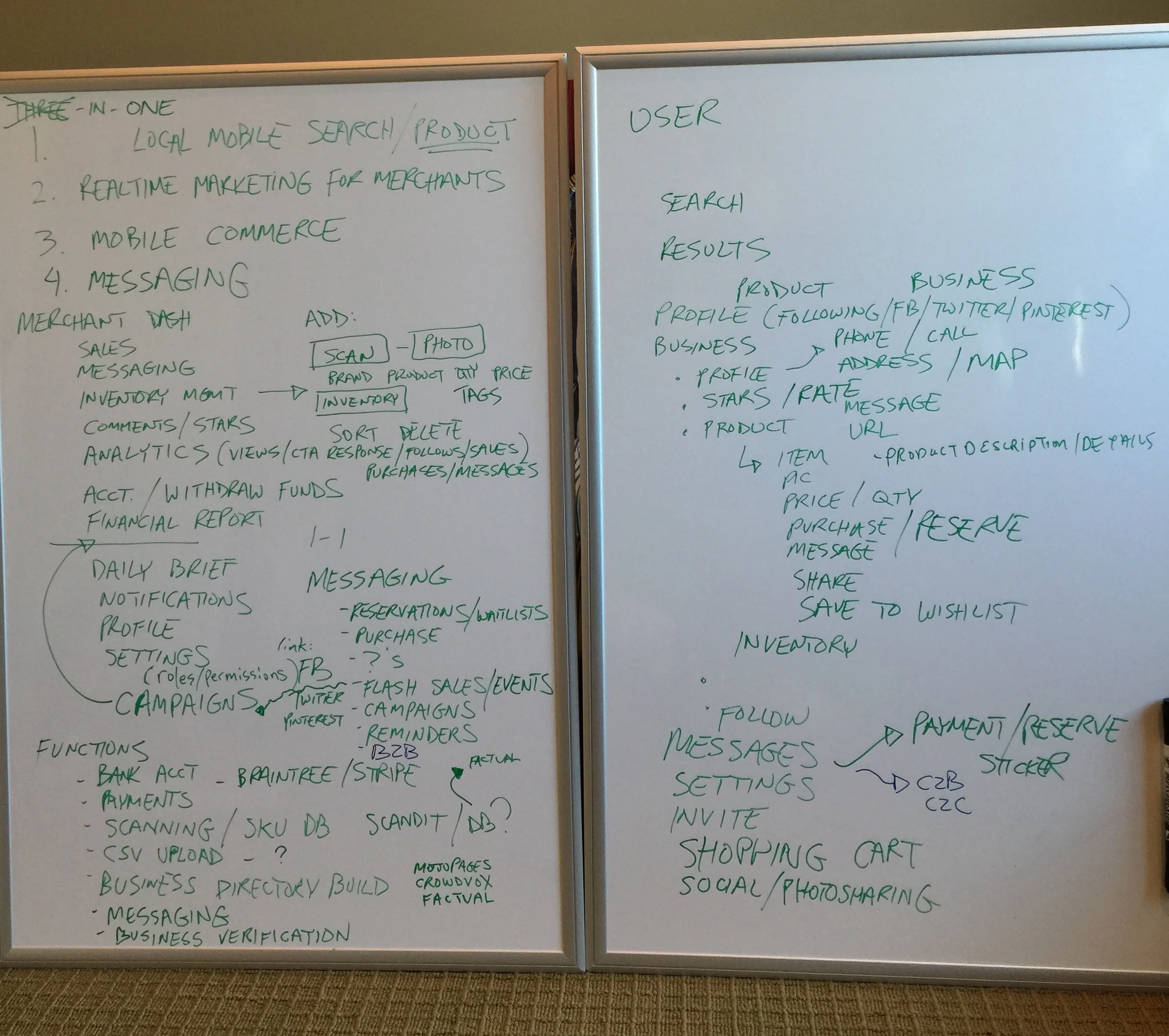
First White Boarding Session
I led the entire design process from start to finish, also helping our engineering team with the design layout in Xcode. It was important for our users to be able to quickly find their favorite merchants, as well as give them the ability to search and discover. We integrated the messaging function at almost every level, to give users a quick method to send a message that provided our merchants with context.
Sketch, Invision for prototyping, and Asana for PM.